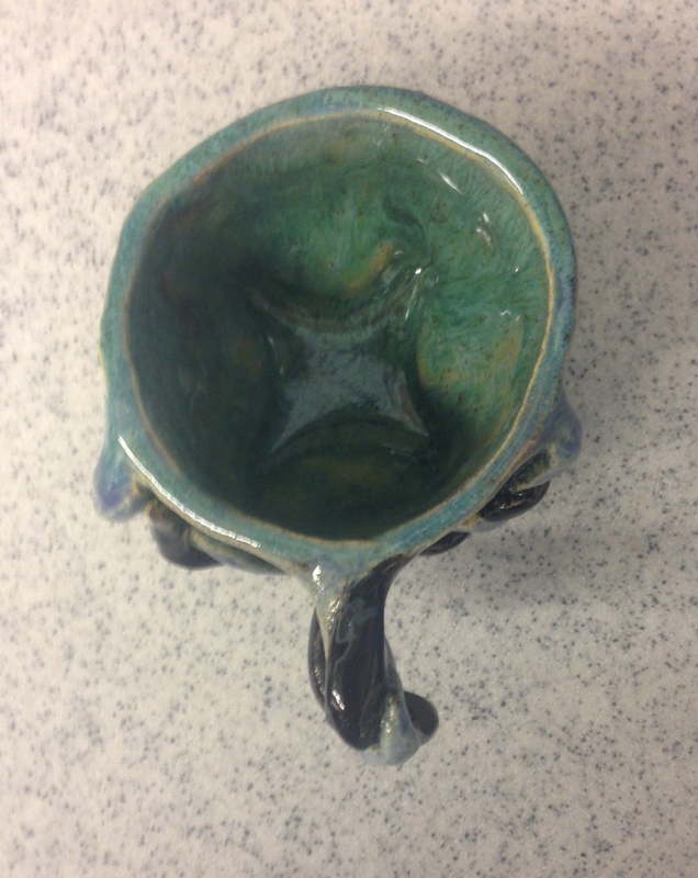
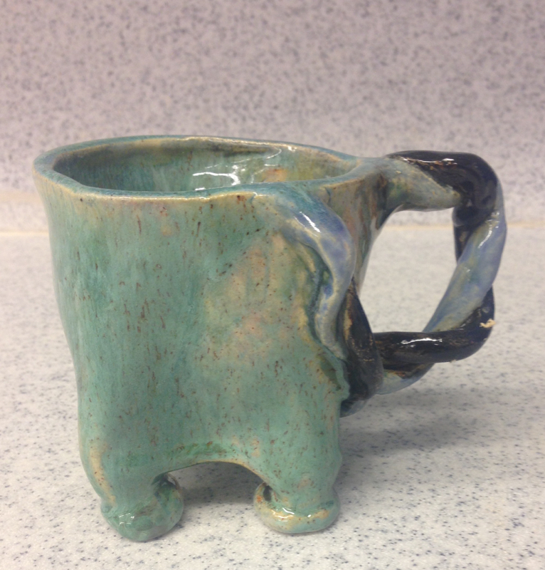
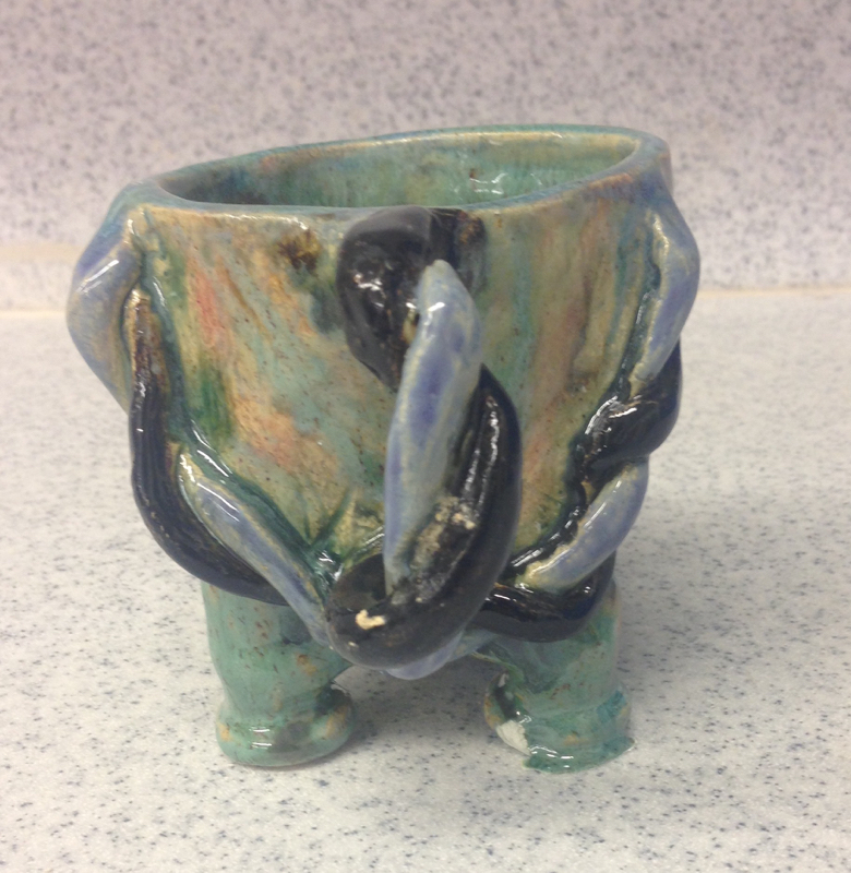
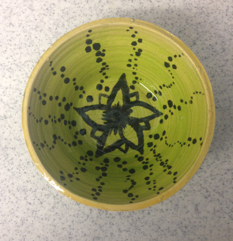
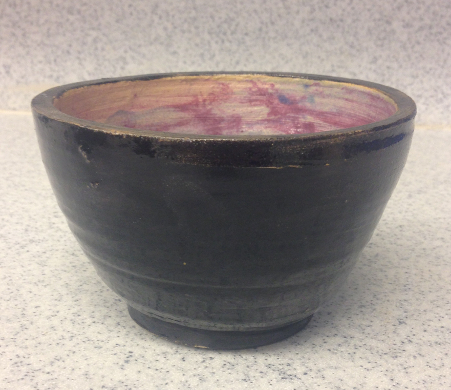
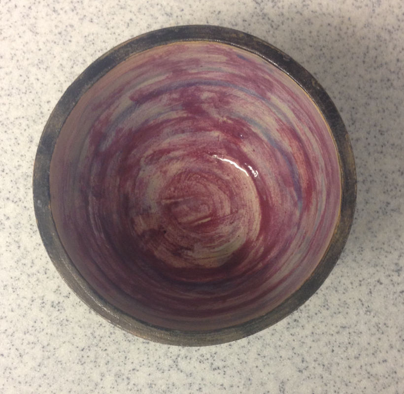
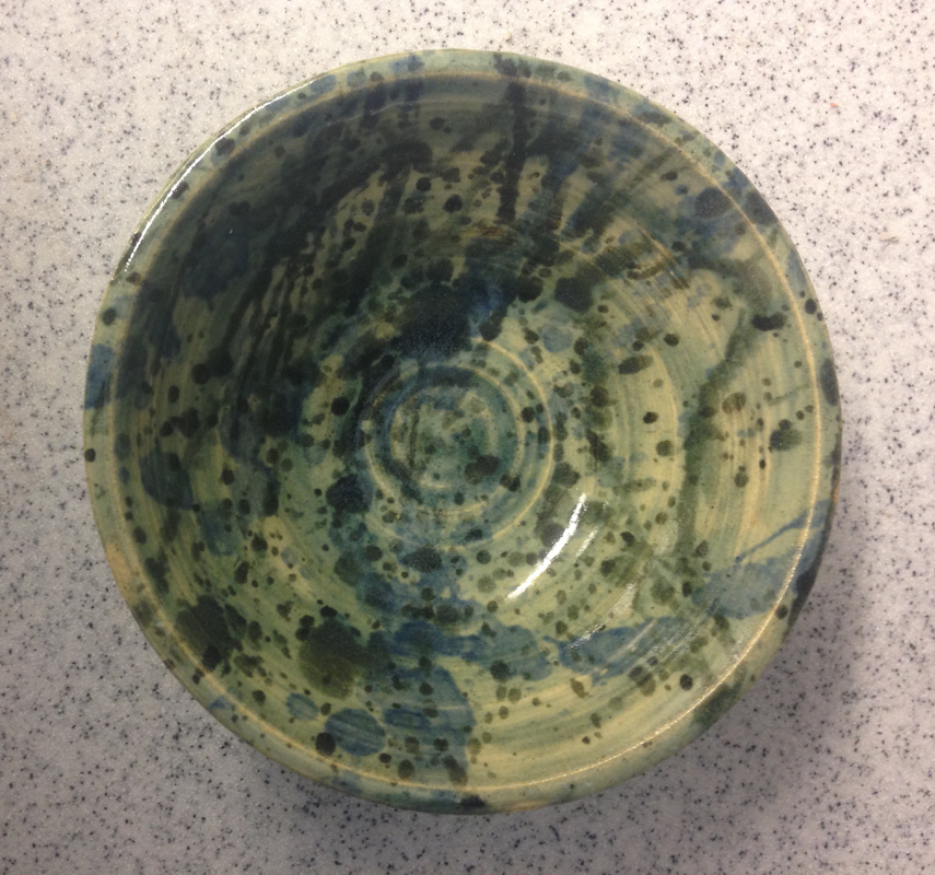
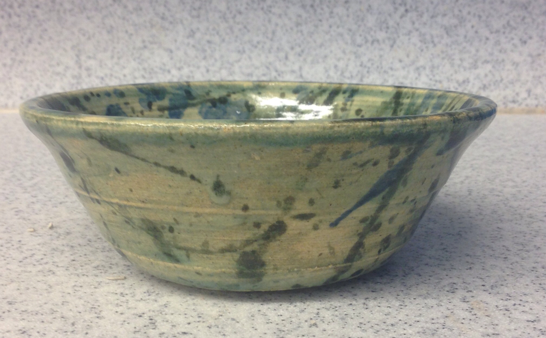
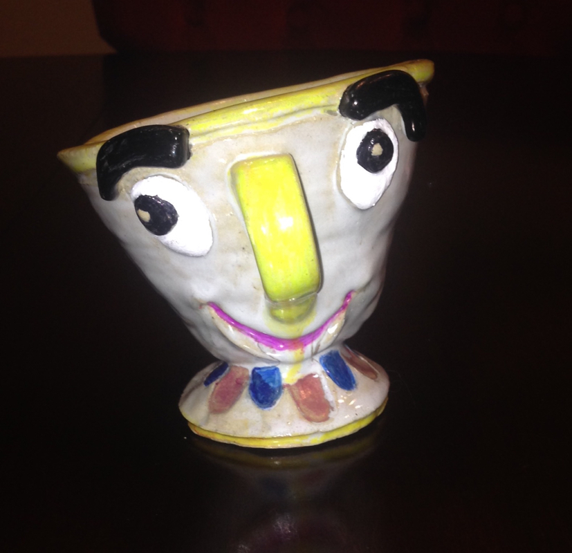
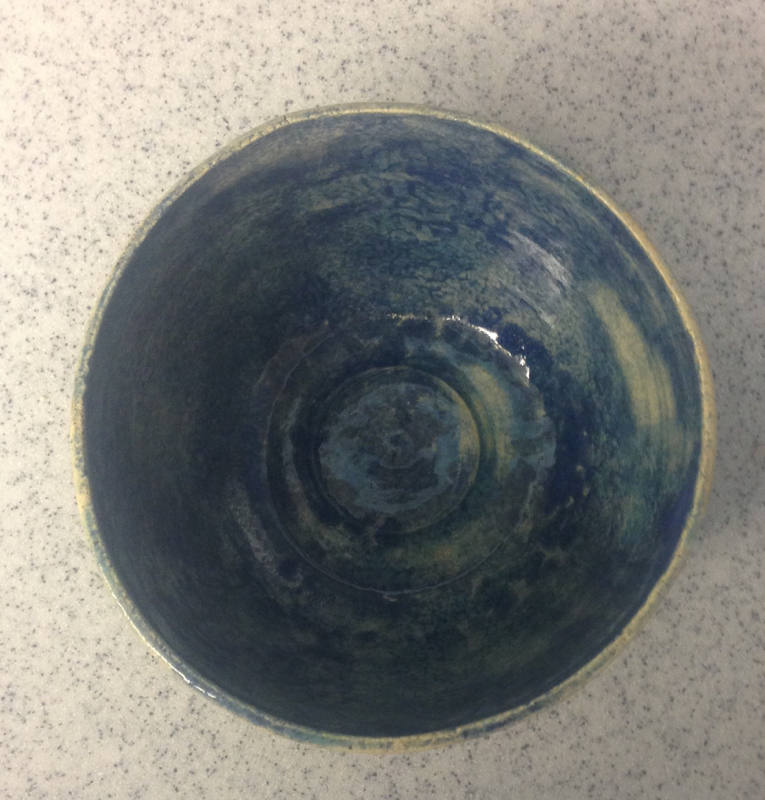
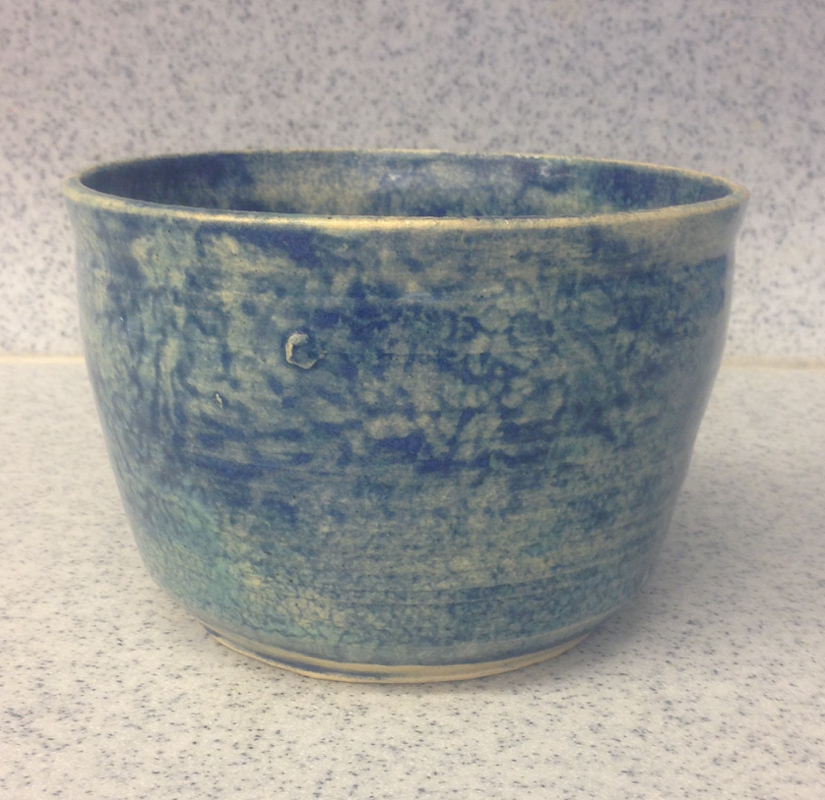
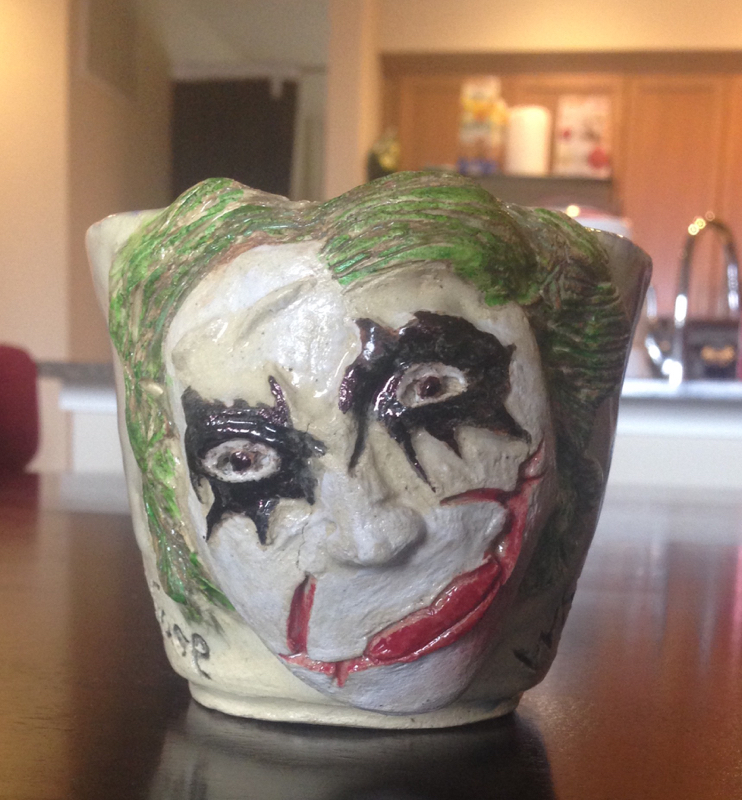
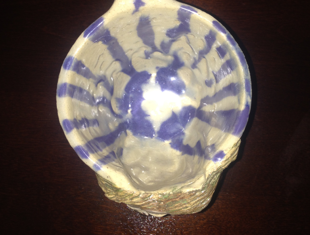
I was bored so I made a improvement on my broken cup. I just mixed a bunch of glazes to see how they would turn out and it came out looking very interesting. Somebof the black glaze ran a little bit on the handle but other that that I am happy with the result.
I made this bowl just to see what the glaze could do. I was expirementing with the colors to see what I would what to work with my other projects I liked the green but the blue in the outside was not even. I wanted to work with solid colors on the bowl to excentuate the shape and style of my project. I tried to have a deep red and blue to mixed in to make it come off like a galaxy. I am going to try this again and put stars on the inside to see what it will turn out like. My splatter bowl was a great way to throw some glaze and make art. I wanted to use a new technique and I just ended up throwing a bunch of colors at my bowl. I wanted to focus on a carefree look and still be able to have it look clean and neat. Overall I think that this bowl came out great! I saw another student use this technique on one of their projects, so I just had to try it for myself! I made my cup on the wheel and when it came out of the bisque I used regular masking tape to get the design I wanted. After that I decided on the colors I wanted to use. I picked black, green, and purple for my colors to complement each other but still stand out with vibrant colors.i did struggle with keeping the tape on, because the glaze kept getting underneath. After I master how to do that my lines will be clean and crisp. This project started off broken. I made a cup but the bottom was too thin and the bottom fell through so I decided to improvise. I added the bottom and I thought it kinda looked like a tea cup so I got the idea to make chip from beauty and the beast. I really enjoyed spending time on the details of how it looked in the movie so it did take a while to finish. But once it was finished and glazed it looked like he came straight out of the movie. For his big bowl I wanted to give it texture so I spounged green and blue glazes to give it that wavy look. I liked how the colors came out so vibrant in the inside of the bowl but I think in the outside I put the glaze in a bit too thin so you can see some blank spots. Overall I like the look of this piece and in the future I might spounge some more projects. With this bowl I wanted to use a symmetiical design for my glaze. The goal was to make it look rustic. I wanted to show the natural sandy color of the original clay and to only glaze where I wanted to show color. I choose the color scrap brown because I didn't know what j would look like so I took a risk and to my surprise it was just what I had hoped it would be. This plate was a fun project that didn't take too much time. I cut out a slab and then molded it into a paper plate. After that I stamped my first and last name onto it and at the very bottom I put my family initals into a heart. I made this cup to be a present for one of my closest friends who is obsessed with the Joker. I didn't know how this would turn out but whenever people see it they have two reactions one "that is really creepy" or two " that is awesome." I still don't know how to feel about it. This cup has a lot of detail work in it and it took me a little bit longer than normal to finish. I tried to match the colors from the movie as close as to the colors that were avaliable. Around the cup i engraved a quote that says "why so serious put a smile on that face." I love this quote because I think it ties the whole theme together. |